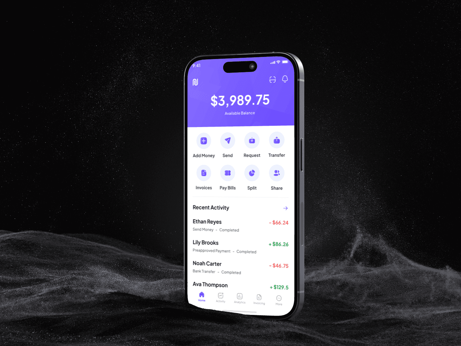
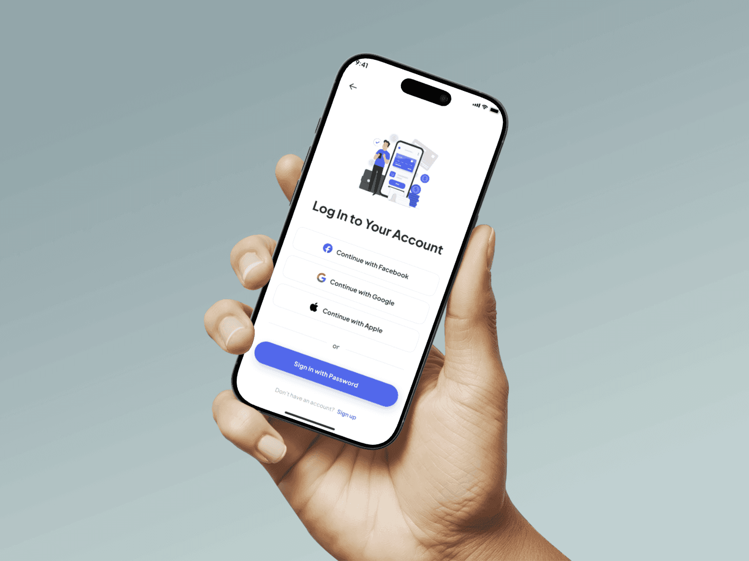
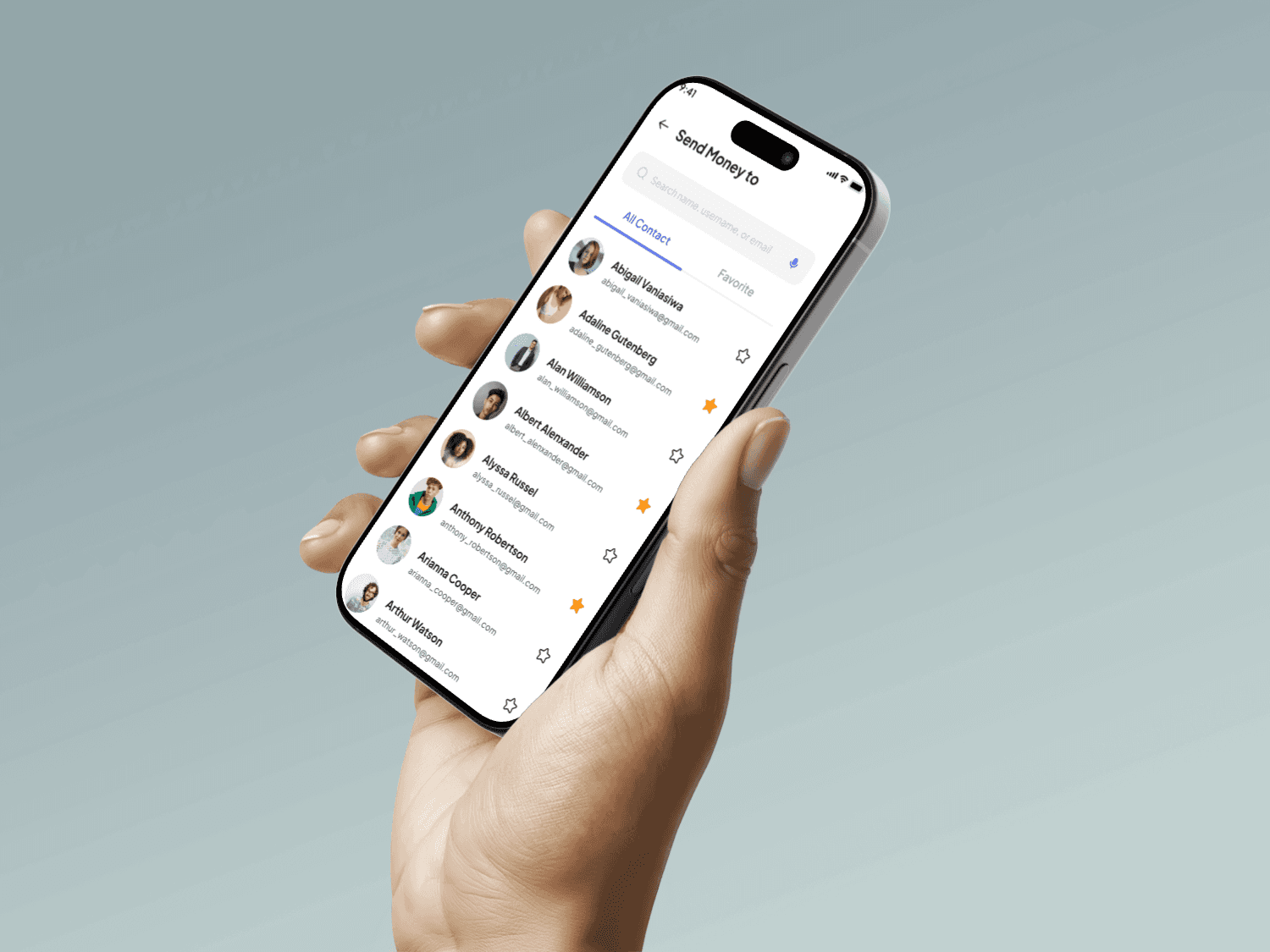
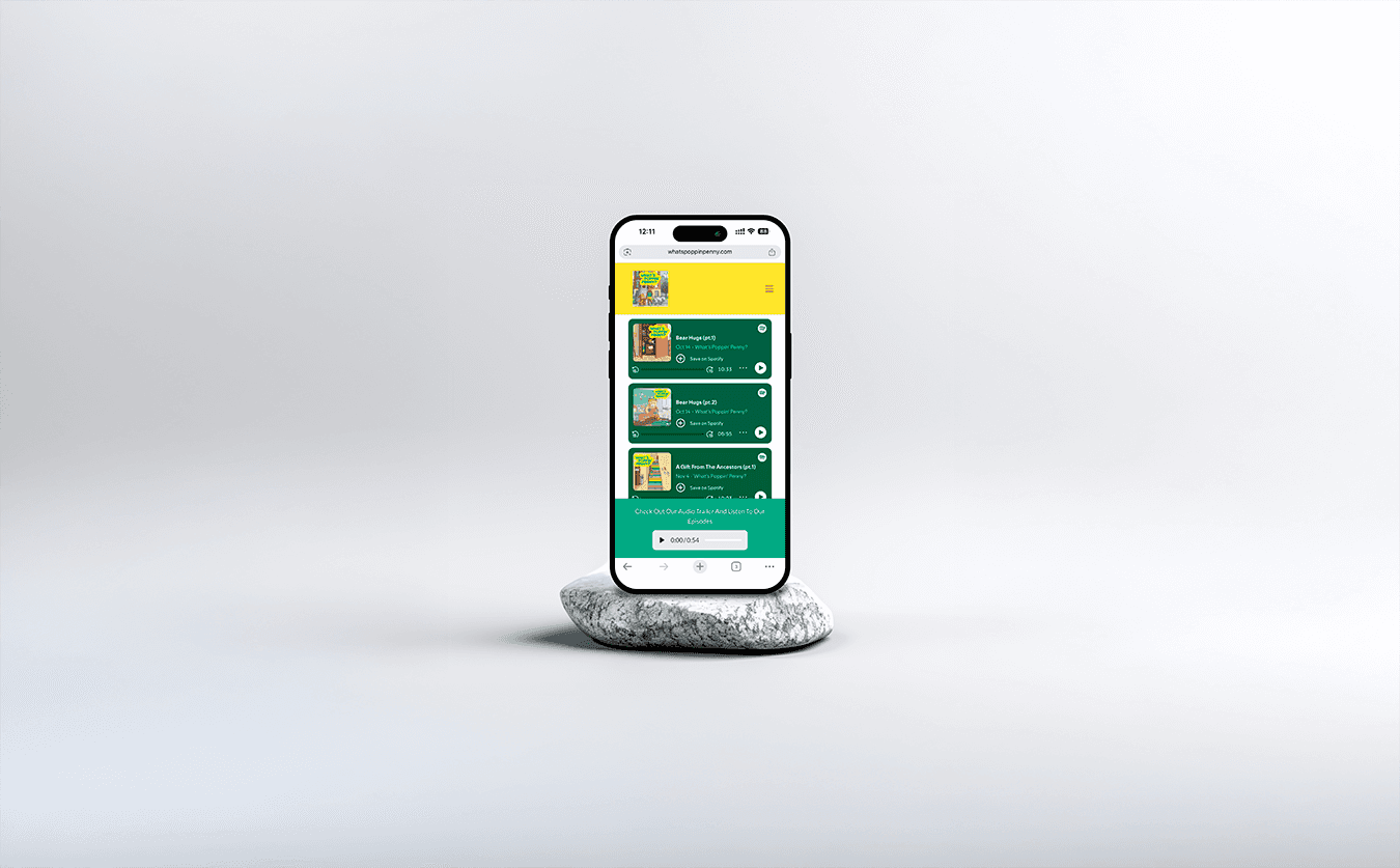
One platform, three very different jobs.
Home service companies live on reviews, but most review tools are built for marketers. Grow Reviews had to work for the technician in the van and the owner running the business, without either one wading through the other’s screens.
- The problem
- Review tools are built for marketers. This one had to work for technicians in the field and owners in the office.
- What I did
- Role-based views across web and mobile, one shared design system, and a landing page in the same project.
- What it became
- An end-to-end platform where each of three roles lands straight on their own job.
Same product. Each role lands on its own job.
Instead of one dashboard with everything, every role sees the task in front of them. Switch roles to see what changes.
Simplified recreation for this page, with sample data.
Technician
- Their job
- Ask a happy customer for a review before driving to the next job.
- What I designed
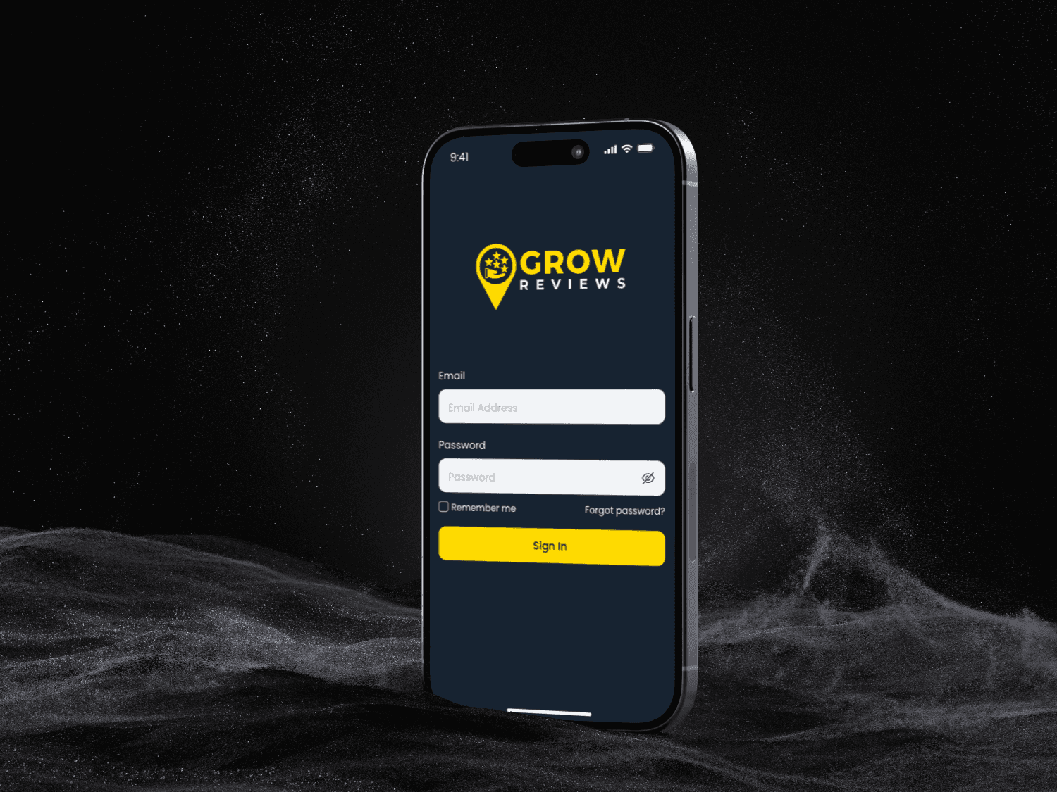
- A mobile flow to send a review request, add project photos and record a video testimonial in a few taps.
- What I kept out of the way
- Analytics, settings and everyone else’s work.
Admin
- Their job
- Know how the company is doing and where customer feedback needs attention.
- What I designed
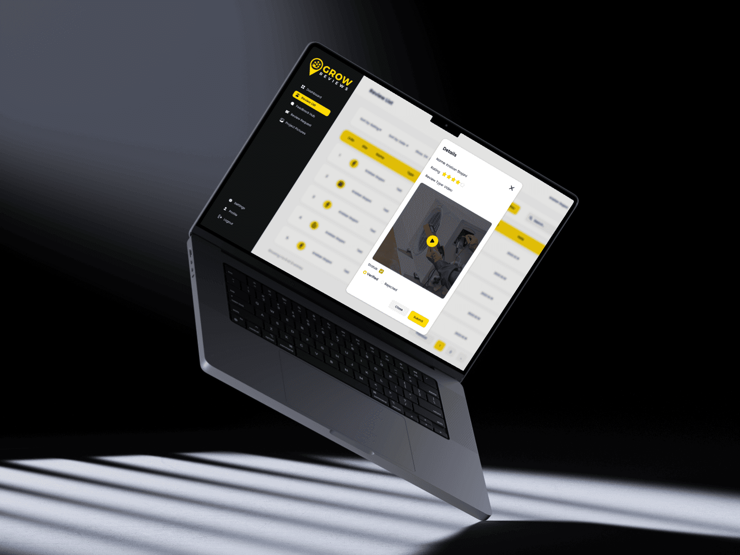
- A dashboard that leads with review performance and feedback, with team and company settings one level down.
- What I kept out of the way
- Platform-wide controls that only super users need.
Super user
- Their job
- Manage many companies and decide who can do what.
- What I designed
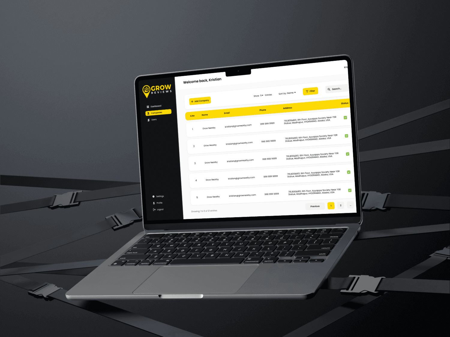
- Company management and permission-based roles that are powerful but never crowd anyone else’s screens.
- What I kept out of the way
- Nothing is hidden from them. Their tools are simply hidden from everyone else.
The decisions that shaped it
Skip full wireframes
Direction was clear and the timeline short, so I went straight to high fidelity and got feedback on real UI. The tradeoff: more rework risk, which the component system kept cheap.
One system for web and mobile
Color tokens, a type scale, buttons, form fields and review states, built once in Figma and shared across both platforms.
Role-based views, not one dashboard
Three users with three jobs. Each lands on their own task, and admin controls stay reachable without becoming the main event.
Landing page in the same project
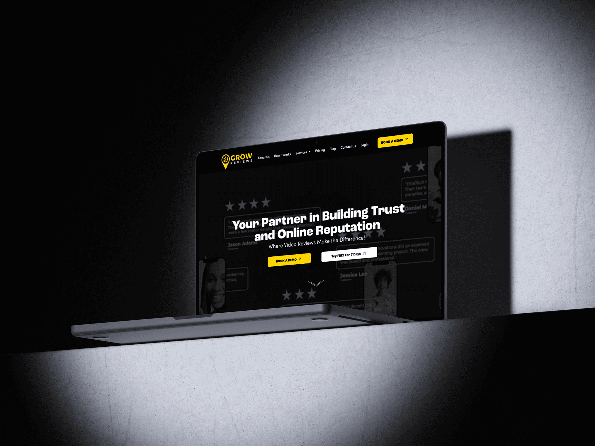
The marketing site and the product tell one story, with value props written for first-time visitors.
Handoff with every state
Clickable prototypes for review capture, company setup and feedback widgets, plus annotated files with edge cases documented for development.
Final screens